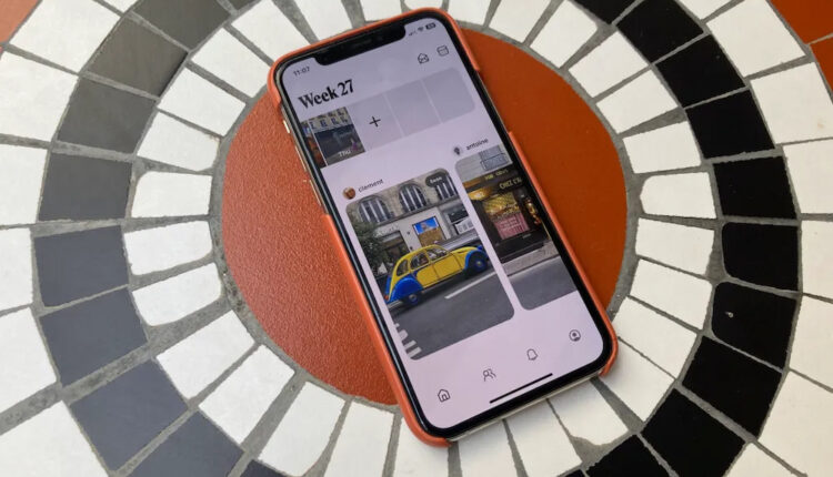
Retro, the popular app for privately sharing photos with friends and family, alleges that Google Photos has drawn significant inspiration from its interface and functions for an upcoming update.
According to information shared on social media, Google Photos is beta testing a new “My Week” feature that aims to showcase users’ weekly photos in a curated format. Similar to Retro, it allows inviting contacts to view selections and includes setup steps to choose images from each week.
The design also mirrors Retro’s horizontal layout displaying photos in a “filmstrip” style with rounded borders. While Google did not address comparisons directly, a spokesperson confirmed experimenting with My Week in an early access mode.
Co-founder Ryan Olson of Retro parent company Lone Palm Labs reacted to initial details with an emoji implying familiarity with the concept. However, CEO Nathan Sharp remains cautious, acknowledging that beta options frequently change before public release.
As former Instagram engineers, Sharp and Olson understand iterative testing within larger firms. But Sharp notes if My Week launches as seen, Google could replicate their focused experience for family photo-sharing alongside broader storage and editing capabilities.
Retro differentiates with an archive solely between close connections, no advertising, and privacy of data and photos and natural language processing. It continues refining features like collaborative journals and free postcards to fuel their unique social approach.
Only time will tell how Google Photos may evolve My Week or if a dedicated space remains for intimiate photo connections on Retro away from distraction of mass audiences and analytics on larger platforms. But the saga highlights opportunities and challenges for startups as tech giants rub shoulders exploring similar markets.


